Designing for 30th Street Station
In Spring of 2014, I had the good fortune of taking Professor Dennis Paris' New Product Development class as part of my M.B.A. curriculum. The class was straightforward – Professor Paris split us into groups and asked us to develop a new product for 30th Street Station in Philadelphia employing various new product development, marketing and organizational strategies. User research and identification of consumer needs were to be the primary drivers of product development. The process encompassed the entire product development cycle from user research to ideation, prototyping through marketing, forecasting and launching. It was a great experience and this post provides just a short overview of the process.
Problem-Solving
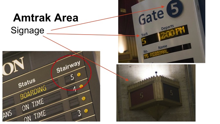
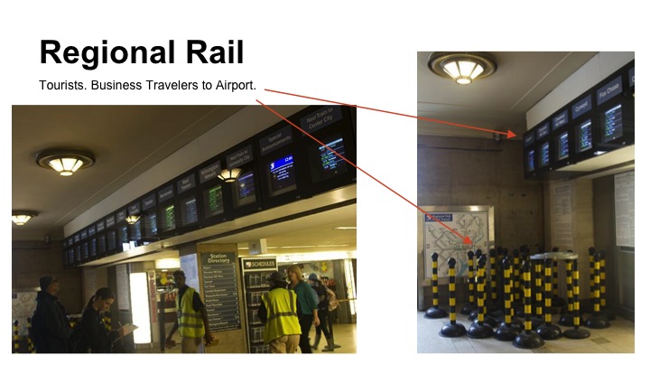
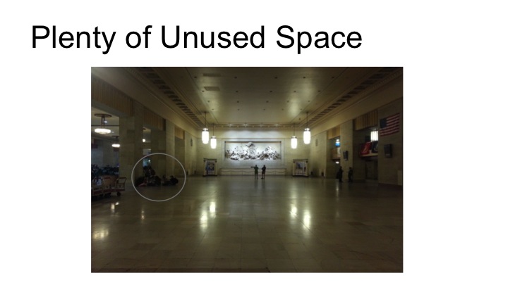
If you have ever visited Philadelphia, you have likely passed through 30th Street Station. It houses Amtrak and Philadelphia's SEPTA regional rail. Compared to other train stations, New York's Penn Station, for example, 30th Street is relatively pleasant. However, signage and services are disorganized and there are a number of areas that could benefit from improvement. With that in mind, my fellow project team members and I, six total, set out to 30th Street to discover what we could do to help.
Observations and User Research
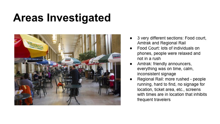
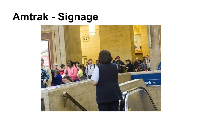
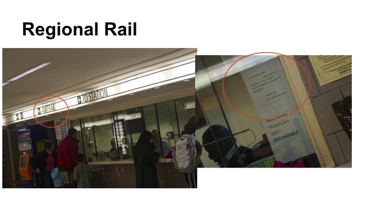
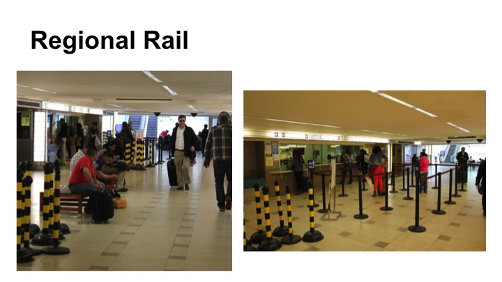
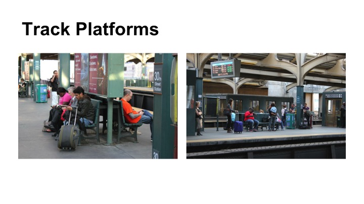
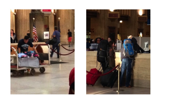
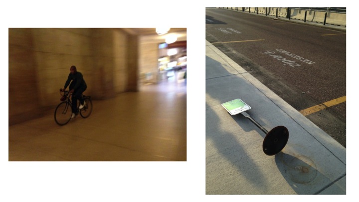
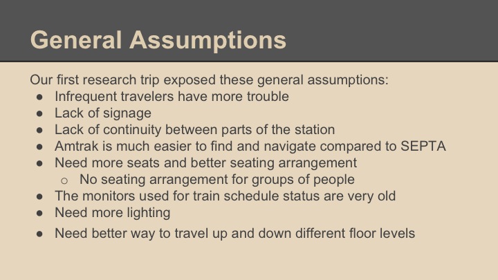
The first trip to the train station was really a fact-finding mission where we observed travelers moving in and out of the station and interacting with its various services:

Digging Deeper, Synthesizing Research
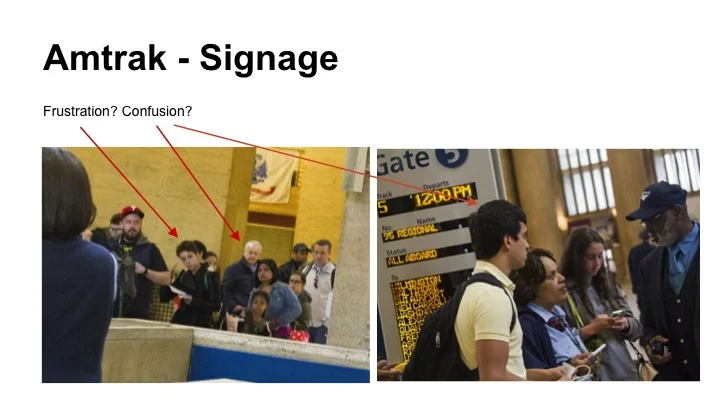
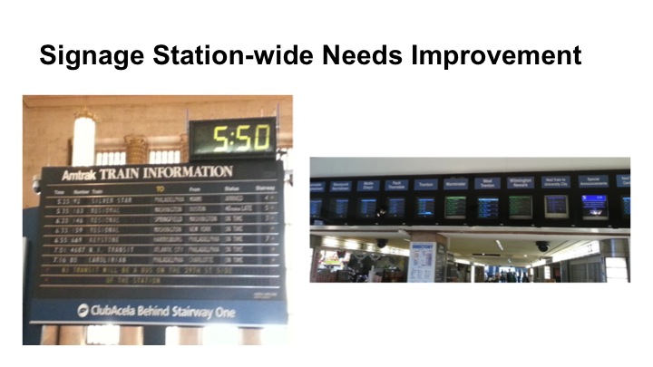
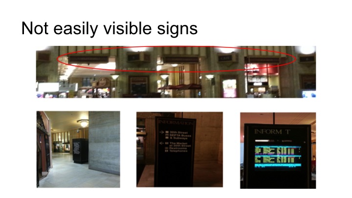
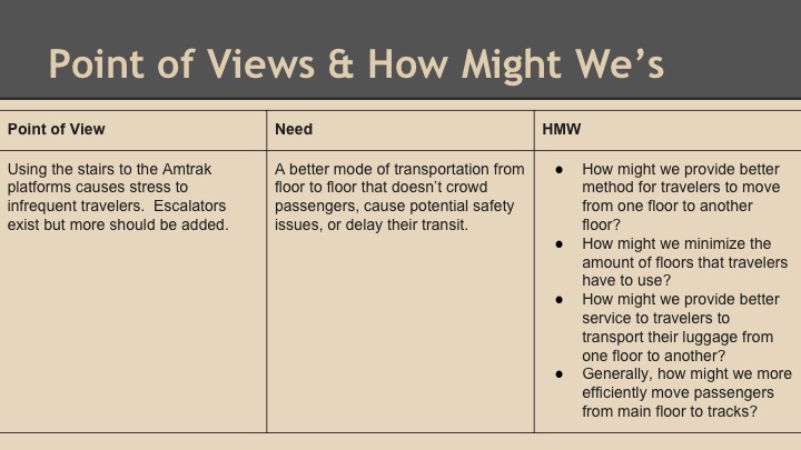
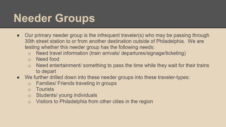
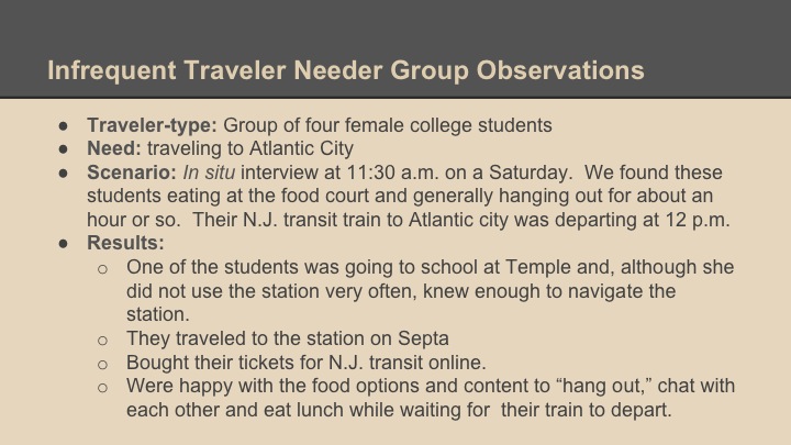
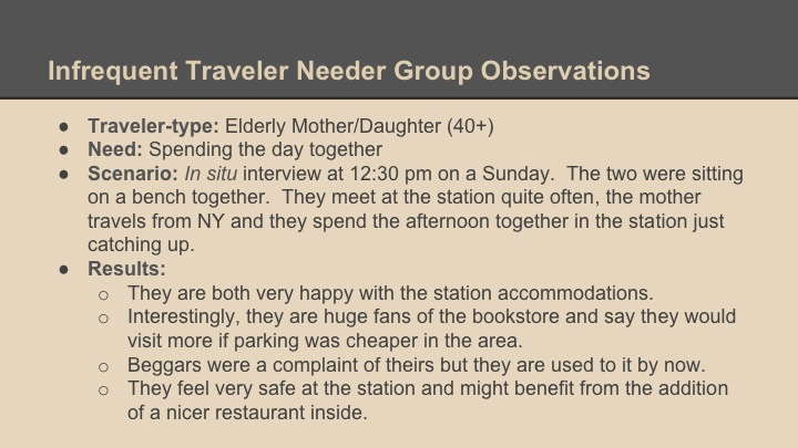
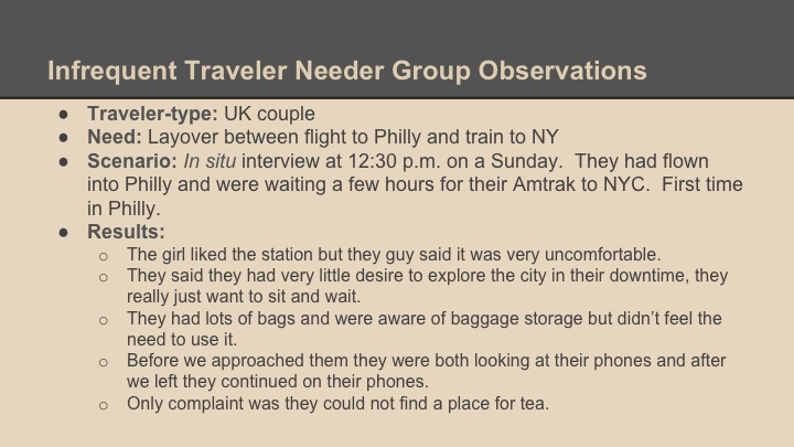
One of the things that became apparent in our early research was that there were a whole host of areas of needed improvement but our goal was to try to focus on an area we thought could yield the greatest return. Before making a final decision we started to try to better define our users and how we might help them by synthesizing data, needfinding and defining traveler types:

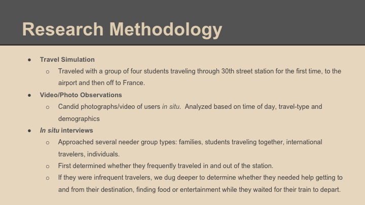
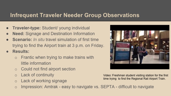

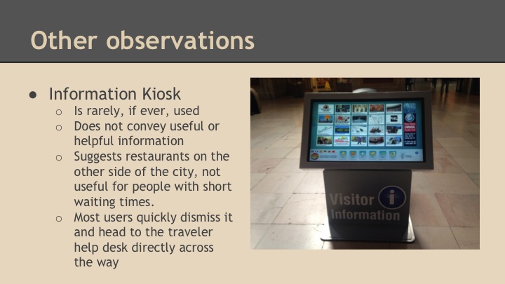

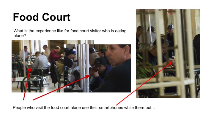
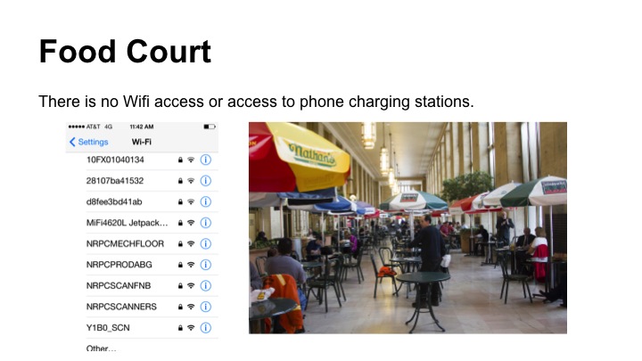
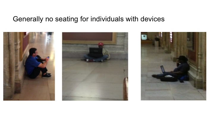
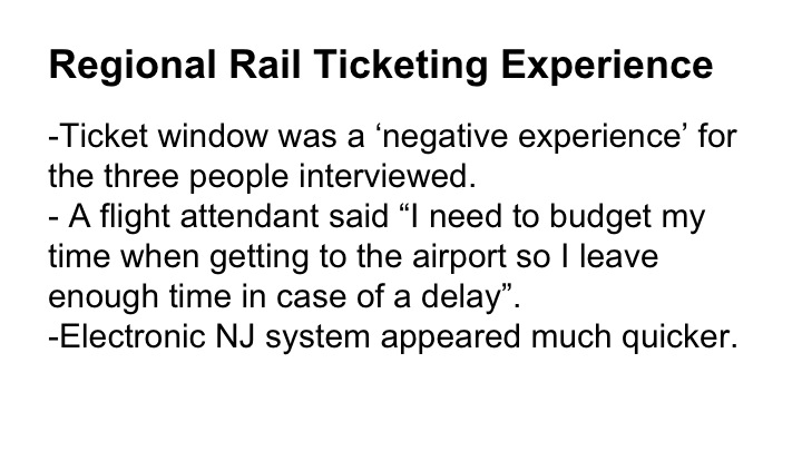
Some of our findings prompted us to go back and conduct more research. For example, these are a couple of videos I took of travelers interacting with different station services (somewhat creepy, I know, but necessary):
Focus
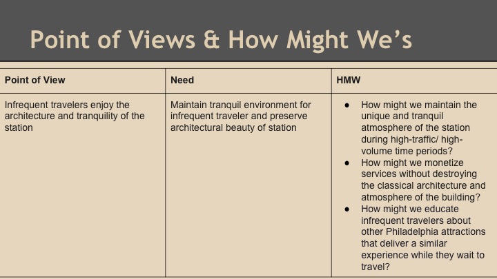
After crunching the data, identifying different strengths and weaknesses of the station and much deliberation, we settled on a specific target user and need.
Here is where we settled:
- Target User: travelers that infrequently pass through 30th street station, whether they are tourists or simply rarely use transit.
- The Need: clear and consistent directional assistance.
- Desired Outcome: getting infrequent travelers where they need to go quickly, without thought or deliberation.
- Essential solution attributes:
- Highly visible and straightforward
- Clear and consistent visual cues
- Information delivery through a comprehensive system of signage across various physical and digital touch points.
Prototyping: Testing Different User Theories
Once we defined our target, we began prototyping. We knew we wanted to provide our customers clear and concise visual cues coupled with timely and relevant information. Prototypes were a great way to test our assumptions and gauge reactions:
The Solution: The 30th Street Station Wayfinding System
Our final solution aimed at providing less experienced travelers with an inviting, quick and responsive means of finding destination or station information. This could be accomplished through three intertwined touch points:
- New signage throughout the station.
- A smartphone web app delivered through a connection to sponsored WiFi.
- Information kiosks.
The solution involved these components:
- Clear signage: one of the biggest problems we identified early in the process was inconsistent and unclear signage throughout the station. It appeared that SEPTA, Amtrak and the other services in the station were imposing their own interpretations of what information was important rather than asking travelers what they needed. In addition, those organizations were imposing their organizational structures on travelers, forcing them to conform to the way they ran their businesses rather than conforming to the way customers moved through the station.
- Consistency: regardless of whether the user was on our web app, looking at a sign or at a kiosk, they should be seeing the same visual cues and receive the same universal messaging and symbols.


- Cues: users would be prompted to access wifi through projected signage for more in-depth information. We deliberately chose projected signage rather than physical signage to maintain the beauty and tranquility of the station.
Projected Signage
Ultimately, the system was designed so that any traveler frantically moving through the station could successfully navigate the station by seamlessly moving from signage, to kiosk to phone, leaving one touchpoint and picking up exactly where they left off at another.
Here is an exemplary user journey:
Enter the station >
Take visual cue from signage to head to SEPTA >
Realize you need information to get to the airport >
Use kiosk to determine that information >
Wait for airport train > while waiting you realize you need public transportation information for when you return > access web app through wifi and determine that information through the app.
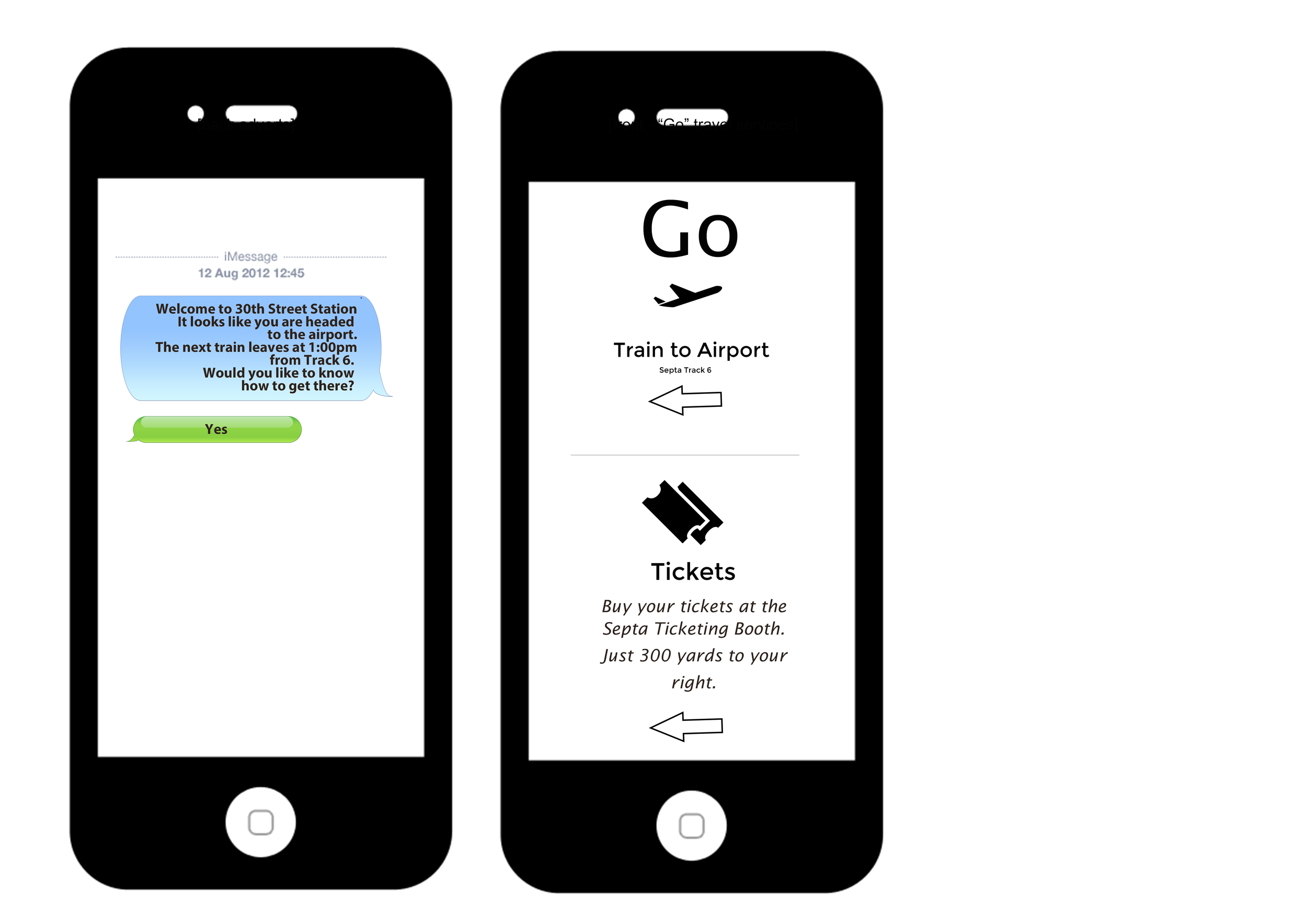
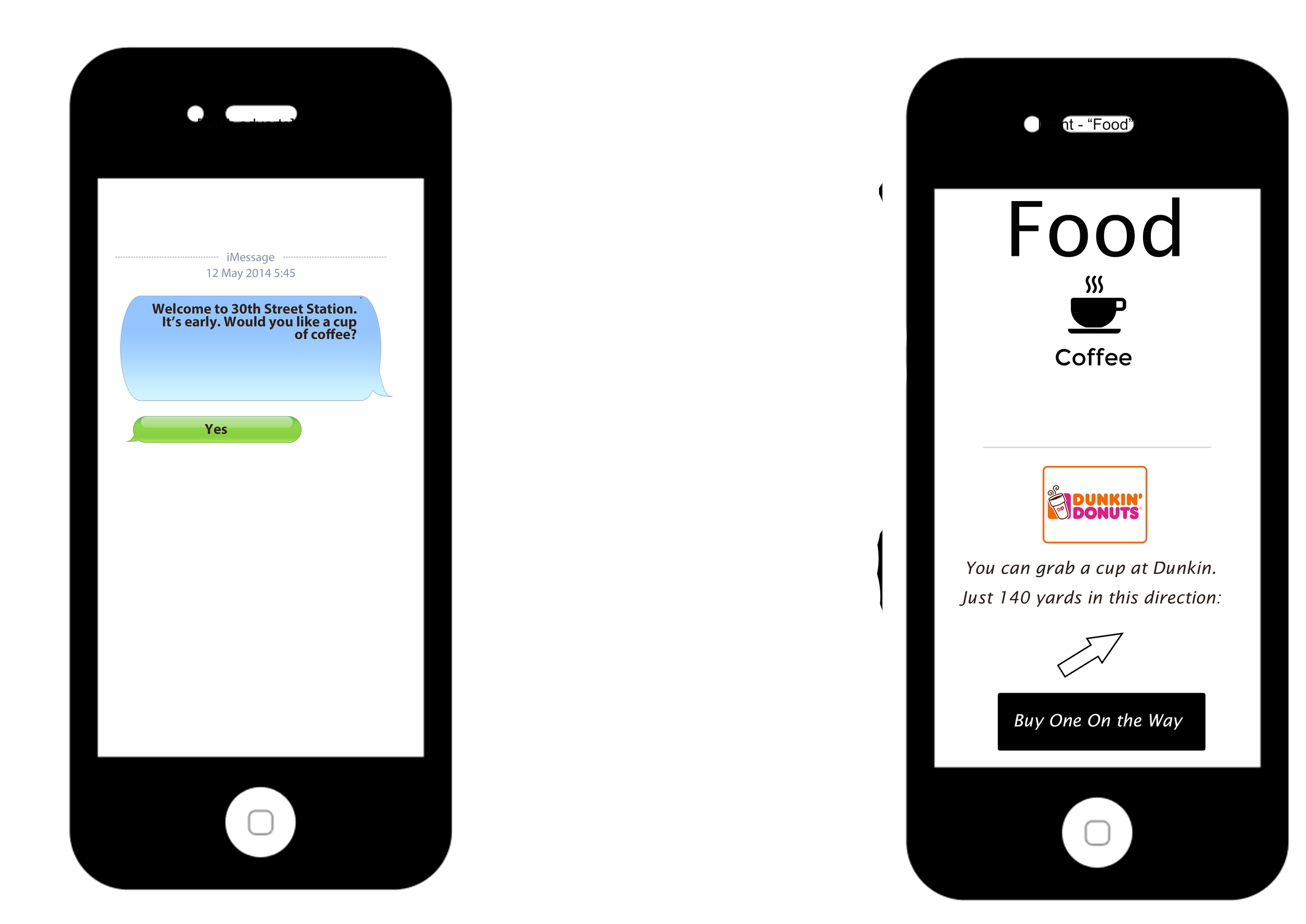
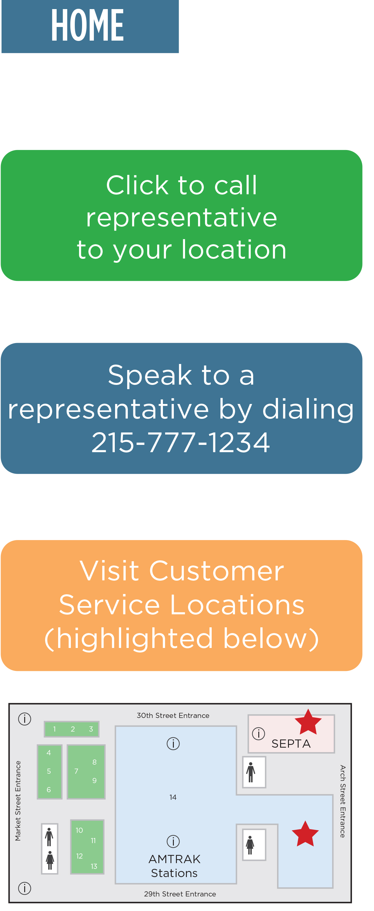
All of this should be intuitive, require no learning curve and, if all else fails, you push a button and a station representative will come to you, finding you through the phone's geolocation or kiosk's location id.
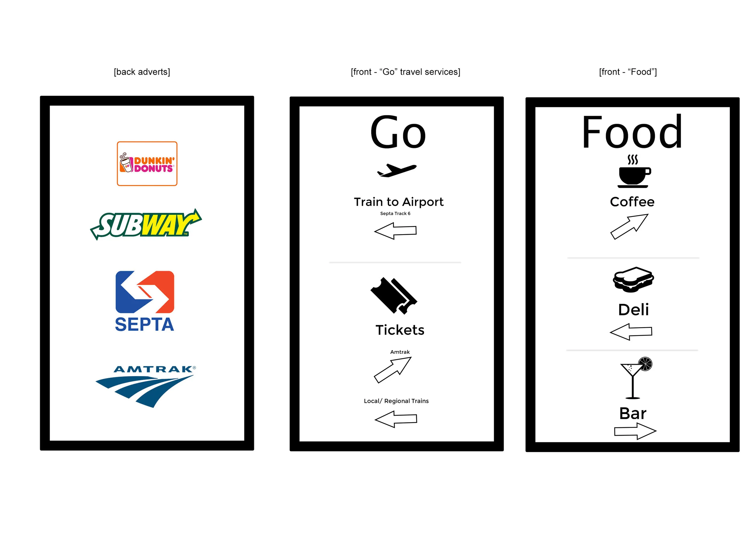
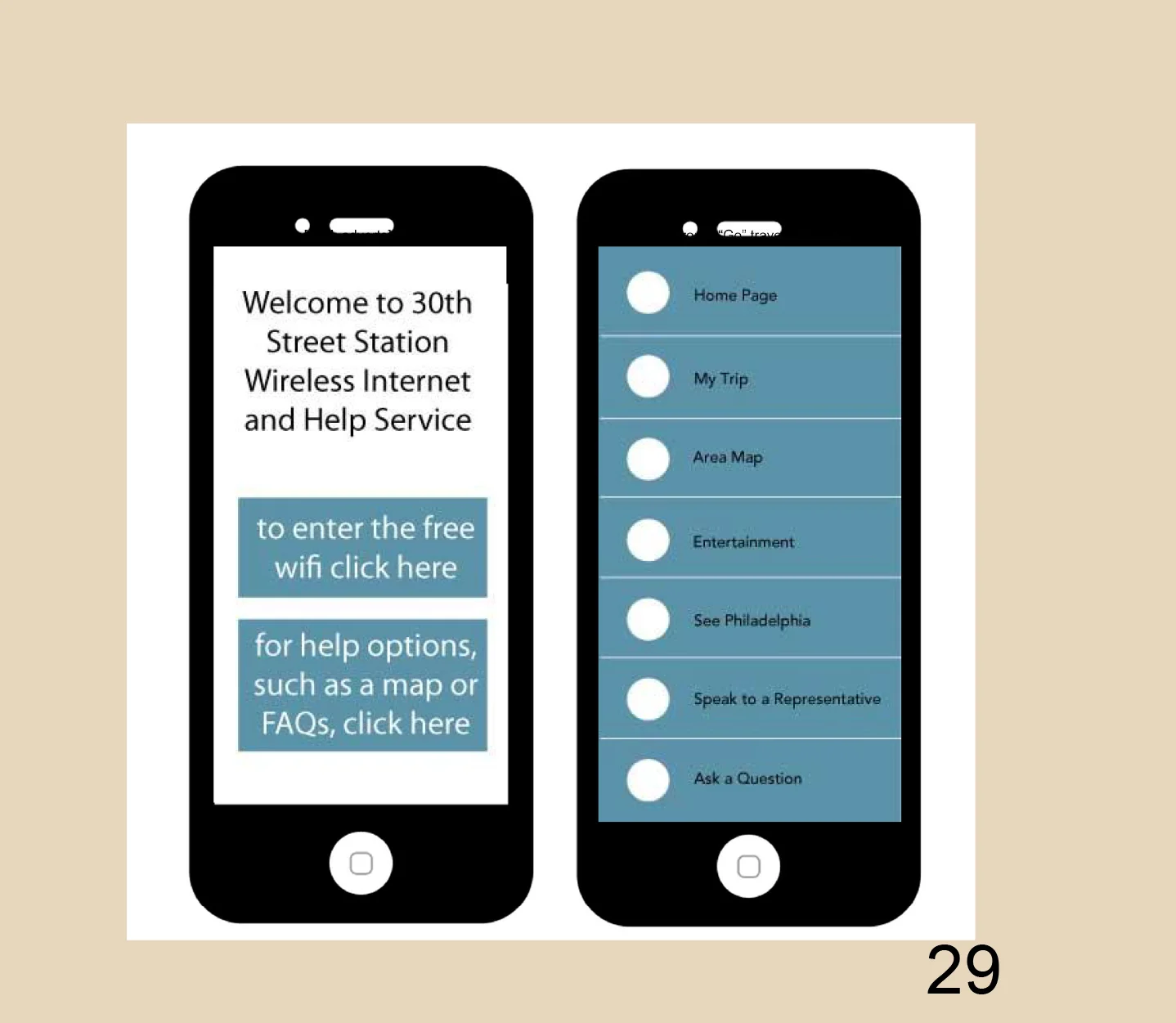
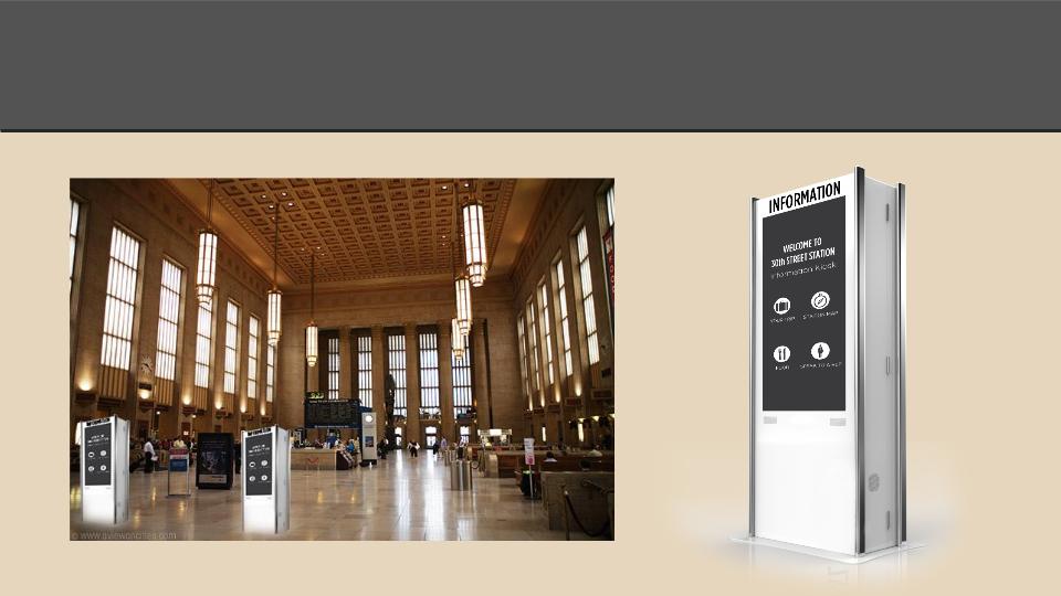
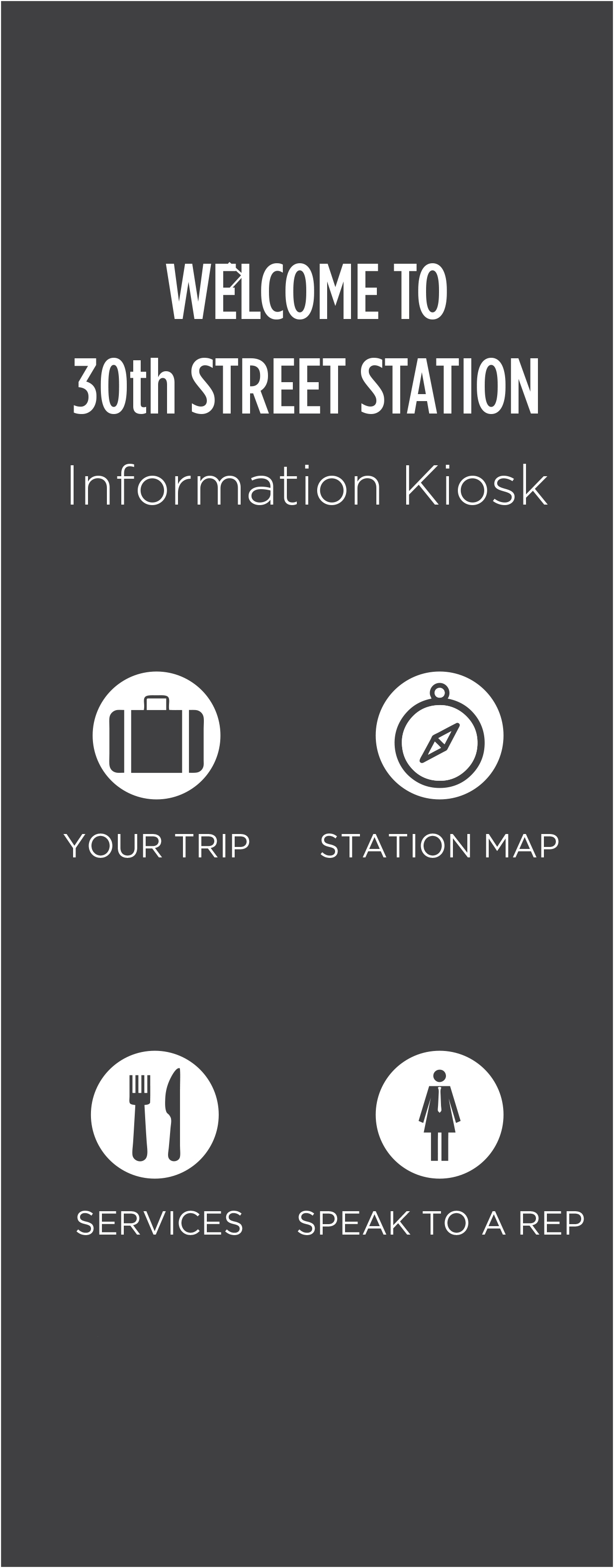
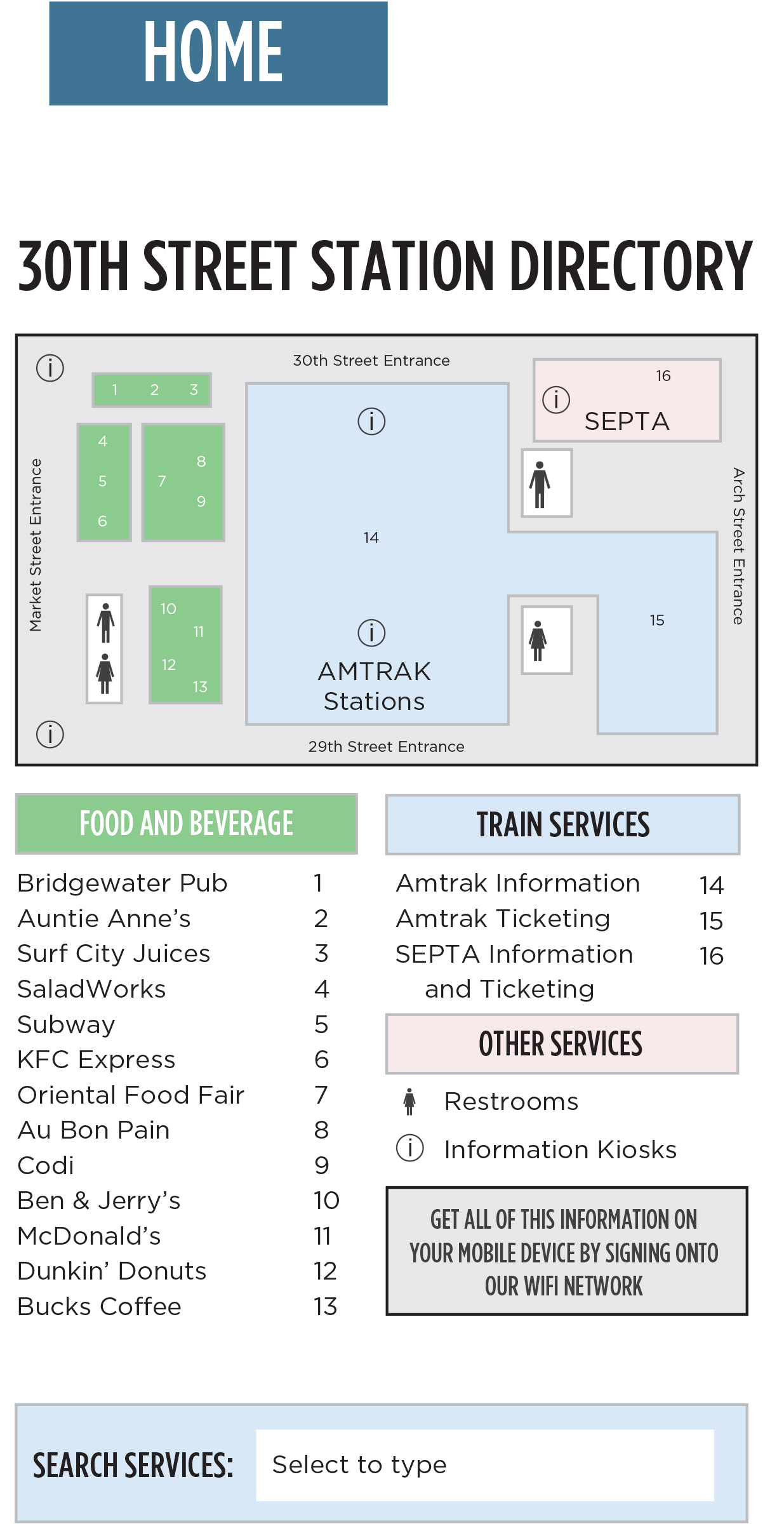
The Kiosks:
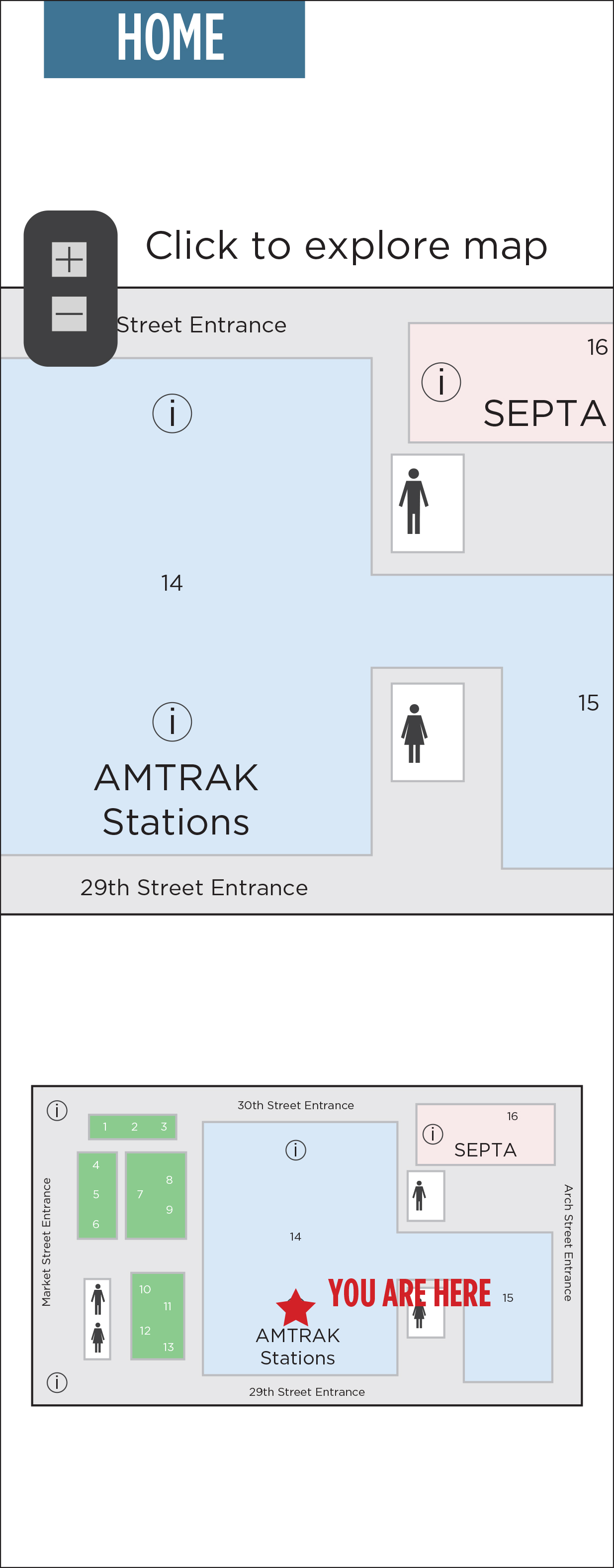
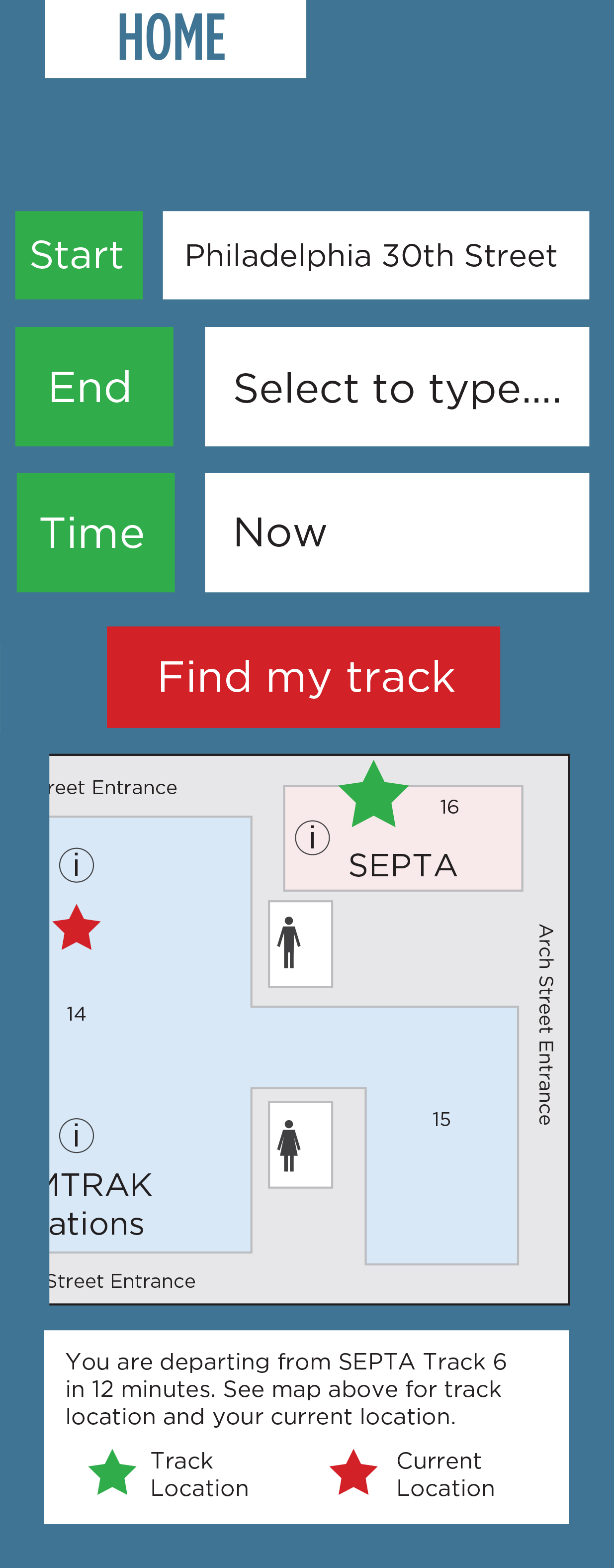
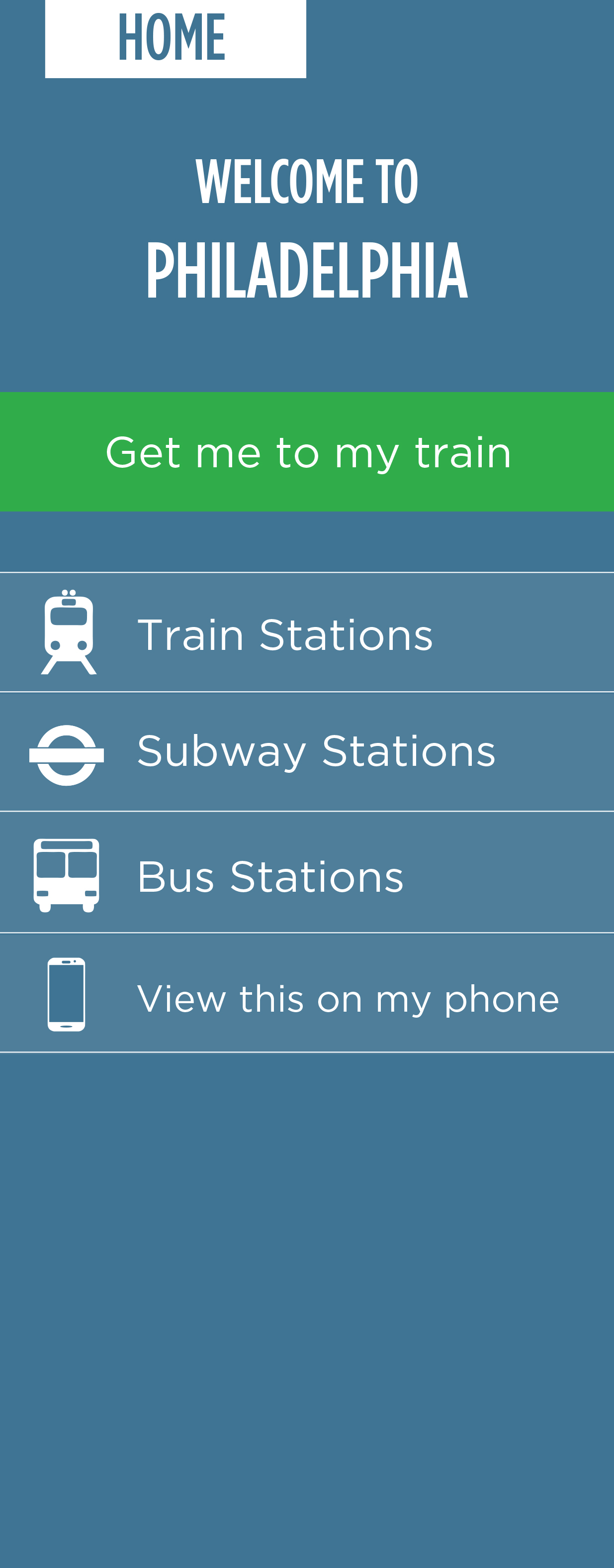
The Web App (only the initial screens the rest mimicked the kiosk):
Phone screens
Conclusion
Designing a new product for 30th Street Station is a difficult process. There are a variety of stakeholders and countless needs. Moreover, one thing I left out of this discussion was our financial and market analysis. Business considerations are a huge factor here and there were a number of indications that there might actually be no lucrative market for some of the needs. Regardless, the most important outcome was learning that you must put in the effort on the frontend to determine what your customers need rather than starting from a solution and working backwards.